
Tempo Dance Festival
Festival Brand Identity
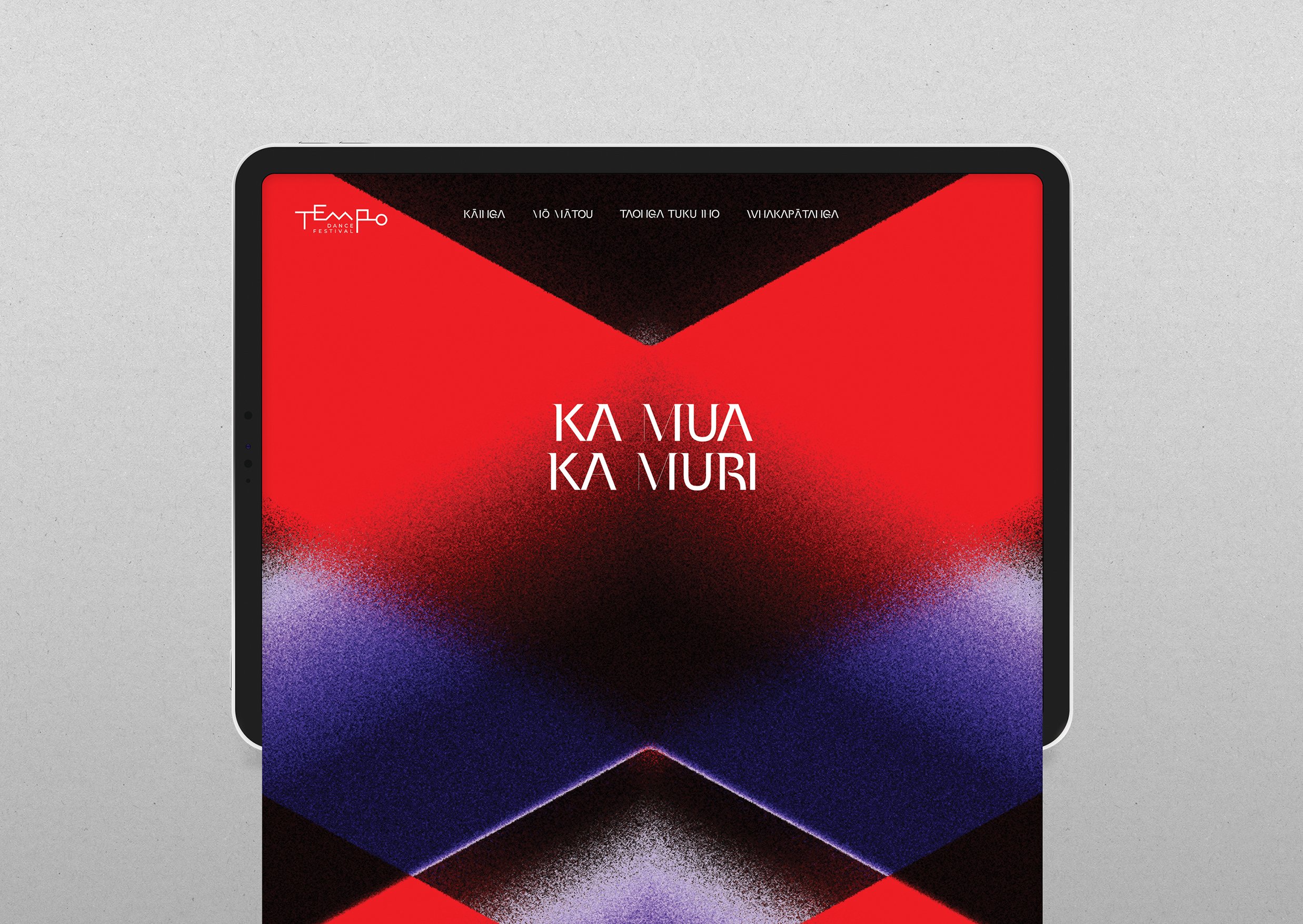
Ka mua, ka muri (walking backwards into the future) was the Festival whakataukī, to celebrate the past as the means to move confidently and innovatively into the future. This was kept in mind as the inspiration for the design.
A unique graphic tohu was created to portray this concept and ideas of movement and direction. We settled on taki rua as a symbol of moving back and forth. Taki rua within raranga is a pattern commonly referred to as ‘two up, two down’, with rows of the pattern running in alternate, opposite directions. To a Western audience it looks like an arrow.
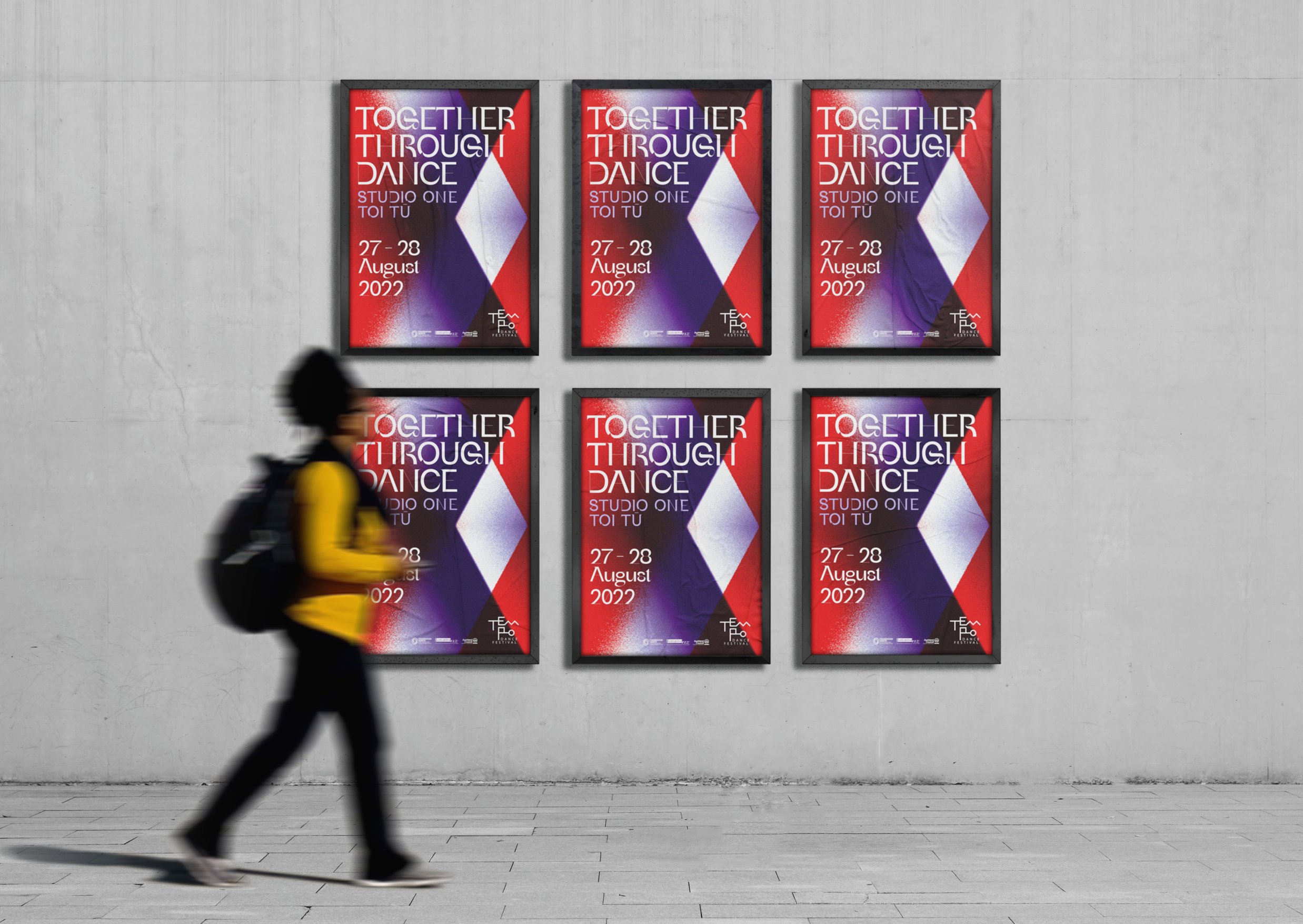
Separating out a single arrow from taki rua, we represented the back and forth by overlaying a second arrow pointing in the opposite direction. One coloured red, representing energy and momentum, the second purple, complimenting the red and representing reflection on the past. Both arrows are partially transparent and granular in parts to give glimpses of the overlapping states in between, where we dwell in the present. These colours also feature heavily throughout the 21 years of the Festival’s historical collateral, so are a nice tie back to Tempo whakapapa.
Channels
Brand Identity, Festival Collateral, Social Media, Digital and PR